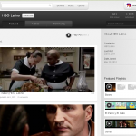
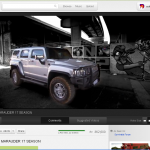
 Google is in some serious mood to bring a whole lot of changes to all of its services after the release of Google+ . Recently Google released the new Google+ like avatar of Gmail, a completely new design of Blogger and now is the tern of YouTube. The new look of YouTube is just experimental. The new UI is much sleeker , elegant and is a dark theme opposite to the white interface used by YouTube earlier. You might also observe a slight change in the logo of YouTube it appears to be more red in the Tube
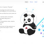
The new experiment is called the Cosmic Panda. I don’t understand what were they thinking while they were naming this thing. Well whatever be the name of this experiment I must tell you that it is really awesome. Before you only got 2 sizes of the player window to choose from but the new interface allows you to chose from 4 different choices of player sizes. The Recommended section is also looking very cool, it now has a larger thumbnail of the videos on the right column. One very good thing that this experiment has is when you open some channel before it used to play the last uploaded video directly even if I didn’t wanted to see it. So this is a really good change. It also have a sleek interface to navigate between videos, playlists, and channels.
Click to enlarge the images
You can join the experiment from here. At any point of time if you want to go back to the previous white version you can again go to the link given above and click on older version.
YouTube is also offering many new cool experiments that you might like to check out (Click Here)





Great weblog here! Also your website lots up very fast!
What web host are you the usage of? Can I am getting your affiliate link for your host?
I desire my website loaded up as quickly as yours lol
Thanks-a-mundo for the blog post.Much thanks again. Will read on